Pick who buys from you and one mood word, press Suggest, and the generator below draws a full brand color palette: the main color, the accent for your buttons, the text, the links, the cards, the header and footer, and the fonts. You see it on a sample website in light and dark at the same time. If you already have a logo, start there: let’s look at what you already have before inventing anything. Every set it draws passes the contrast rules that keep text readable for people with low vision, so you are choosing between good options, not guessing. When you like what you see, send it, and the palette lands in your inbox and in ours.
How to use the color scheme generator#
- Pick your trade, who pays you, or a mood word. Any one is enough; the other two fill in from it.
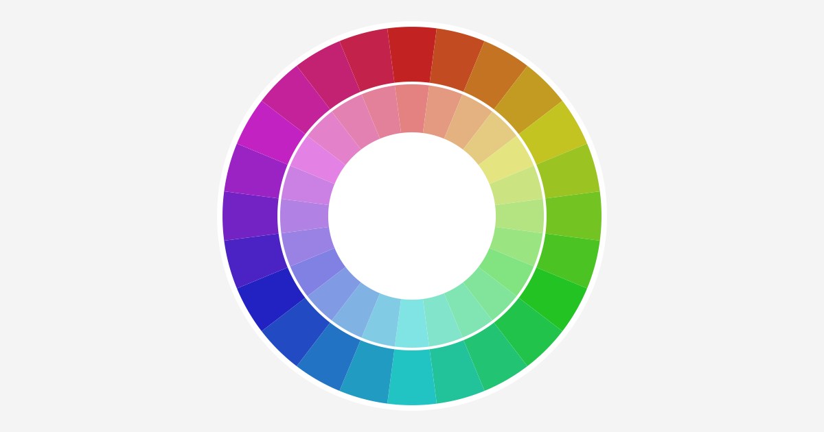
- Press Suggest, or press a color on the circle to start from that hue.
- Look at both samples. The light one is your site in the daytime; the dark one is how it looks on a phone set to dark mode. Point at a link, the menu, the button or the footer link to see its hover color.
- Tick OK beside any color you want to keep. The next press changes only the others.
- Tick Lock on light or dark to keep a whole look, or press Redo on one look to draw it again on its own.
- Pick fonts for headings, body text and the menu. Each choice uses fonts most devices already have, so it adds no load time.
- Fill in your name and email and press Send my colors.
Want a specific color? Click any swatch and choose it, or type its code, such as #1E3A5F, in the box beside it.
Start with who buys, then one mood word#
A color does not sell on its own. It sells when it fits what you sell. A study of logos by Bottomley and Doyle (2006) found colors judged right for the product helped and mismatched ones hurt. Labrecque and Milne (2012) found people read hues as personality: blue as competent, red as exciting, brown as rugged. That is why the generator asks who pays you first. A homeowner with a burst pipe wants calm and fast, so the palette is a steady blue with a hot accent. The owner of a high-end home expects restraint: charcoal or black on white, with one muted metal accent.
Pick one mood word, not two. Two words are two palettes, and the generator will happily draw both if you press it twice.
One accent, saved for the button#
The button that asks for the call or the quote should be the one color on the page that stands apart. A button the same hue as your headings disappears into them. So every set holds one accent, and the generator picks it by a color wheel rule: straight across the wheel for the loudest contrast, a step to either side for a softer one, or a neighbor for a calm set. Everything else on the page is your main color and quiet tints of it.
Readable for everyone#
Some of your visitors read your site with low vision, on a dim old screen, or with the sun on their phone. What helps all of them is contrast, and it has a number. The WCAG 2.1 contrast rule from the W3C asks for 4.5 to 1 between body text and its background, and 3 to 1 for large text, which it defines as about 24 pixels, or about 18.5 pixels in bold.
Every set the generator draws clears those numbers, and the check mark beside each color in the table says so. Type in a color that does not, and the mark turns into its ratio, so you can see exactly how far off it is.
Color blindness: never color alone#
The National Eye Institute’s page on color blindness puts it at about 1 in 12 men, and the most common kind makes red and green hard to tell apart. So a site never says anything with color alone. Links in your text are underlined as well as colored, a required field says “required” in words, and a red button still reads “Get a free quote”. The W3C’s use of color rule asks for exactly that, and every site we build follows it, at no extra cost.
Dark mode is a second look#
Phones and computers can switch to dark mode, and a good site follows them. Pick only the light look and the dark one is left to chance. The generator draws the dark look with the light one, from the same colors, and checks it the same way, so both are yours and both read.
Fonts: fast first#
Body text uses the font already on your visitor’s device, because a downloaded font slows the first view of the page. Headings carry the mood: a clean grotesque for Dependable, a high-contrast serif for Premium, a rounded face for Caring. Each one is a stack of fonts most devices already have, so it costs nothing to load.